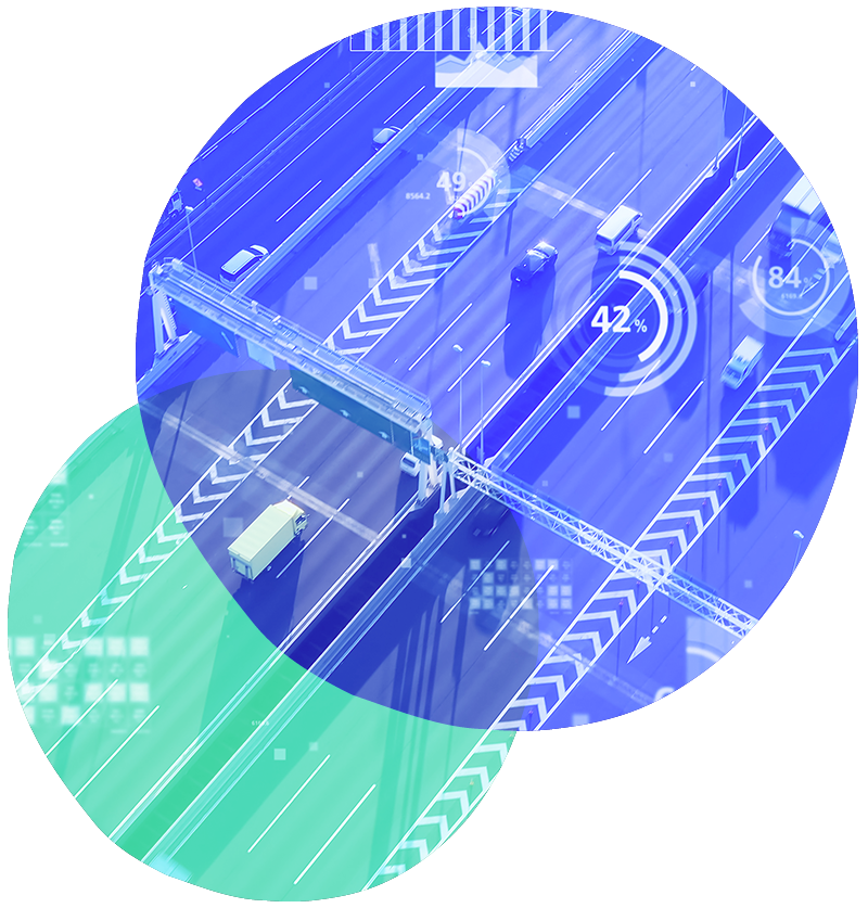
Big Data and Data Visualisation: The Future of Mobility Planning
In recent years, the use of big data in mobility planning has revolutionised the way authorities and administrations understand and manage the territory. Thanks to the integration of heterogeneous sources and advanced technologies, it is now possible to analyse complex phenomena with an unprecedented level of detail and reliability. To support this approach, data visualisation makes data accessible, readable and immediately interpretable even by those without technical expertise.
Big Data applied to mobility: sources, methods and objectives
We have developed solid experience in using big data for urban and metropolitan mobility. Through a network of technical and commercial partnerships, we access continuously updated data sources such as:
- Floating Car Data (FCD)
- Data from mobile phone cells
- Local public transport dataset
This data is integrated and analysed using advanced algorithms to improve the accuracy and reliability of reconstructions. The aim is to provide realistic mobility analyses and identify emerging behaviours.
From O/D matrices to systematic behaviours
The integration of sources allows us to reconstruct Origin-Destination matrices and describe the behaviour of users, commuters, occasional visitors and workers. We also analyse:
- Park&Ride and car park occupancy
- Catchment area of stops and hubs
- Regularity of journeys
- Network speed during peak hours
These analyses support public administrations in understanding mobility needs and defining effective operational strategies.
Transparency, replicability and decision support
The processing procedures are designed to be transparent and replicable. Integration with territorial data allows for precise identification of:
- Network issues
- Opportunities for action
- Investment priorities
The analyses thus become a solid technical basis for planning public policies and monitoring their performance over time.
Data Visualisation: making data visible and readable
To enhance the value of datasets generated by analytical processes, we develop clear and intuitive solutions. Our solutions include:
- Dynamic thematic maps
- Interactive dashboards
- Summary and comparative indicators
These tools facilitate the reading and interpretation of mobility phenomena even by non-technical users, improving the quality of decision-making processes.
Comprehensive analyses for planning and design
Dashboards and control panels allow you to analyse:
- Main flows and directions
- Average travel time
- Congestion levels and accessibility
These representations are designed for administrations, technicians and stakeholders who need to compare scenarios and assess impacts in a uniform and objective manner.
Integration between analysis and visualisation: a single ecosystem
The synergy between big data and data visualisation provides a coherent and layered view of the territory. This approach:
- Simplifies the identification of priorities
- Supports the design of strategies based on concrete data
- Allows you to monitor impacts over time
Furthermore, it ensures consistency between alternative scenarios, making comparisons between design options clearer and more reliable.
Conclusion
The use of big data in mobility planning, combined with advanced visualisation tools, is now an essential standard. Our solutions integrate accurate analysis, reliable sources and readable representations to support institutions and administrations in developing more informed, sustainable and effective public policies.
The future of mobility is based on data: interpreting it correctly is the key to better planning.
What is Floating Car Data?
This data is collected from moving vehicles (via GPS) and provides information on traffic flows, speeds and journey times in real time.
Why is it useful to integrate multiple data sources?
To increase the reliability of analyses and better describe different behaviours, from commuters to occasional users.
What is an Origin-Destination Matrix?
It is a representation of movements between geographical areas, useful for planning transport networks and analysing flows.
What are the advantages of data visualisation?
It allows complex data to be understood immediately, improving communication, comparison between scenarios and operational decisions.
Who can benefit from these tools?
Public administrations, technical consultancies, planners and stakeholders involved in decision-making processes related to urban mobility.
Related Projects
Need more information? Contact us
Contact Us
- Viale Luca Gaurico, 9
00143, Roma - +39 0656546119
+39 3470891843
[email protected]
